PM, Product team
Jan - June 2017
BACKGROUND
About BAPS Charities
- Health & Wellness
- Humanitarian Relief
- Educational Services
- Community Empowerment
- Environmental Protection & Preservation
Why redesign?
In addition, the (previous) website was an MVP version that didn’t receive any major design updates since it’s creation and with the addition of a newly establish brand identity, the platform needed a redesign.
My role
Initial problem discovery
- Understanding the mission
- Learning more about the donation process, how to volunteer and upcoming events
- Navigating the site & understanding of content without information overload
PROBLEM STATEMENT
increasing user engagement and retention?
THE CHALLENGE
How might we design an equipment borrowing system that is intuitive and efficient for students, technicians and the administration?
My Responsibilities
DESIGN PROCESS
The approach
My first step was to identify the business goals, end users and learn more about the platform and different stakeholders. Then, I did in-depth research on the website and users to gain more insights. After having the needed information, I iterated on 2 rounds of design and finally delivered the project. Below is a quick overview of my design process and each step I took throughout the project.

RESEARCH
Project Kickoff
This was followed by a secondary research phase where I conducted in-depth contextual inquiries, user interviews, and then synthesized all of this data into an affinity map that helped me build personas, journey maps, and design ideas.
User Interviews
- Get to know the user
- Learn about everyone's motivations and reason for visiting our site
- Learn how easy users were able to find the content they were looking for
- Learn about what users would like to see improved in the platform
Key Insights from Interviews

Competitive Analysis
My goal was to compare their visual design, website features and homepage content and identify the features BAPS Charities lacks.

Key Insights from Competitive Analysis
- Tell users the mission
- Offer some useful tools
- Display what’s new
- Categorize sub-menus
- Add sub-navigation to sidebar
- Prominent hero section
- Simple and minimal
- Use space efficiently
- Avoid perplexing design
- A layout with hierarchy
- Impactful imagery
- Prominent button
- Keep it simple
- Donate button
- Search functionality
- Summary of site’s content
- Social links
- Donate & Newsletter signup
Usability Testing of Initial Site
Rather than base my new designs on my own assumptions, I decided to carry out some actual usability testing to see which areas of the site people struggled with.
With the help of my Product manager, I was given access to different participants. I carried out the testing with the different types of members that came to the organization (new or returning members), and people who were interested in donating money to the charity.
Below are a few of the biggest pain points I identified on our web pages.
PROBLEM 1
Homepage doesn’t use it’s full potential
- Footer text is hard to read
- Donate Now button is not placed a very prominent area
- There are conflicting hero images & they don’t clearly define the organizations goals

PROBLEM 2
About us page has alot of info
- Too many navigation tabs are causing users to struggle to make a choice of what content to view.
- Users are forced to spend more than a glance to find out what the organization is about.

PROBLEM 3
Donation process is too long
- There was a long and very unclear donation process which caused a lot of dropoff with users.

IDEATION
Meet the Users
Based on my insights and observations from the research methods, I created two primary personas that captured the essence of our users and helped me to address key solutions to their problems & needs. The users typically fell into 2 categories: New and Existing members.


Proposing a New Sitemap
Based on the finding from the usability testing and competitive analysis, I proposed a new sitemap to better serve users and promote the organization.
First, I drew out the current sitemap in order to visualize how my new features can fit into the existing system. This helped me better organize and structure the site’s architecture: so users are able to discover website content and navigate information easier.


DESIGN
Low-Fidelity Sketches
The stakeholders had given me full control over the level of freedom in design since they were not particularly married to their existing designs.
I worked with sketches for the first stage of the interface design. This allowed for quick experimentation and rapid iteration. After sharing the sketches with the PM and other stakeholders, I was given the thumbs up for the next stage. So I moved forward with turning those sketches to mid-fidelity wireframes.


Wireframing Screens
After creating the low-fidelity sketches, I worked my way up to building mid-fidelity wireframes in Adobe XD which helped to map out the shell of the interface, its screens and basic information architecture. This helped me to finalize the functionality and define the interactions before diving into the final solution.

Defining Style Guidelines
To help design a standard and consistent experience throughout the website, I created a Visual Design Style Guide before moving to creating high-fidelity screens.


FINAL SOLUTION 1
Landing Page
- Hero section now gives a more clear picture of our mission and goals and shows how BAPS Charities is a legitimate organization.
- The Donation Button was moved to a more prominent location at the top.

FINAL SOLUTION 2
About Us Page
- Page now addresses all the pain points revolving around information overload
- Fixed up the accessibility issues with the header and footer text & color choices.

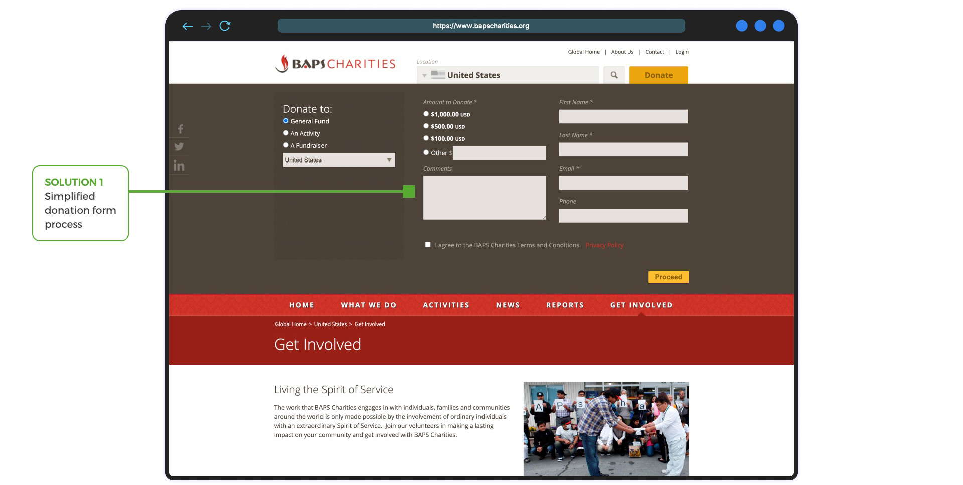
FINAL SOLUTION 3
Getting Involved Page
- The page is now much more minimal.
- There is a reduced the number of steps in the donation process
DEVELOPER HANDOFF
Implementation
After I finalized the design with the PM, I worked with the engineering team to implement the design by presenting the design to the team, providing UI elements, conducting usability testing, debugging, and designing for new requirements during the development process. It took 2 additional months to implement the design for the new website.
RESULTS
Measuring Success & Impact
This new design resulted in a lot of positives. So here’s some data that was pulled just 3 months after launch. All this was pretty significant especially when considering the impact we were able to make and the long term stability of the organization moving forward.
+
%
Daily Active Users
+
%
Avg. Session Duration
+
%
Donors
+
%
More Members
-
%
Exit Rate
-
%
Bounce Rate
REFLECTION
Project Takeaways
- Early feedback is key
It is important to seek feedback frequently. Fortunately, I was able to meet frequently with the stakeholders to discuss sketches, ideas, low-fi, hi-fi and kept them with me in the process. - Designing with a low (0) budget
Since BAPS Charities is a non-profit organization, there was no funding for this project. I learned to conduct user research and usability tests without any expensive tools. I am grateful for this experience where I can solely design for a good social cause. - Don’t be afraid to take the initiative
I learned that the brief is composed of only the minimum requirements. As you move through the design process it is vital to address tasks that were originally not listed in the brief. Sometimes you will need to take the initiative and suggest deliverables that you know will benefit the project in the long run.
OTHER CASE STUDIES

Simplytrak

Walmart Global Sourcing
